Is It the Same for You? A picture book about growing up amidst conflict

‘Is it the Same for You?’ is an unusual picture book, unsettling and beautiful in its representation of a young girl growing up in a conflict zone.
In many ways it’s not just the story of the girl but the story of anyone who has had to come to terms with turmoil, in whatever form.
Neha Singh’s well-crafted words bring us closer to our own experiences through a girl who undergoes much that we might not have undergone — making the story universal and exclusive at the same time.
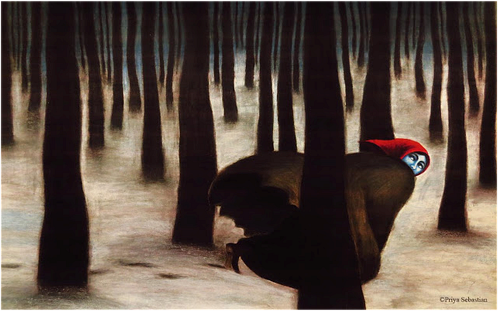
Priya Sebastian’s amazing illustrations place the story in contexts we couldn’t have imagined, by going beyond the comfortable to find visuals that could communicate the depth of an experience and make it a shared one.
Priya Sebastian speaks about the intense work that went into creating this book.
Me — How did this book happen?
Priya — I’d always wanted to try my hand at illustrating a picture book but I wanted to wait until my skills were worthwhile enough.
My work consists primarily of editorial illustrations and the illustration style I have evolved tends to be strong, tilting towards abstraction and suitable for mature themes.

I wanted a story that would find compatibility with my style rather than veering off course to adjust my style to a children’s story.
Around 2016 I started actively looking for a story I could illustrate, one with a relevant message which would sustain my interest. I saw a post by Goethe Institut, Kolkata, about a workshop on Children’s Books based on the theme Children Understand More. Applying seemed the most natural thing to do.
This workshop in Shantiniketan introduced me to the world of Children’s book writers and illustrators. The environment and the exchange of ideas were stimulating and memorable. Somewhere during my time there I was handed a story that was thought suitable for my style. The story was written by Neha Singh and it was about a young girl growing up in a conflict-ridden zone.
Me — What went on in your mind when you first read the story?
Priya — The theme and the structure were unusual. It was devoid of description of any sort and contained only the voice of the young girl expressing her thoughts, running through it. The text was spartan and non-linear.
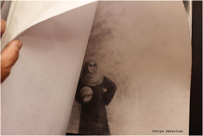
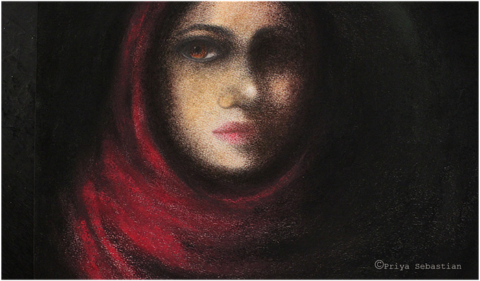
I recall thinking that, with a story like this, the easier route to illustrate would be to show the young female protagonist framed in a headscarf, beautiful, big-eyed and sad, eliciting pity. Such images are rather popular on the internet.
The more challenging route to take however would be to illustrate this story from a different perspective. What that perspective was, I did not know at that point.
Me — Tell us about how this different perspective evolved.
Priya — I had no idea what I was venturing into when I decided I wanted to do a picture book. Once I took the plunge, I realized several things, the primary one being that there had to be a common element running through all the illustrations in the book.
Since the structure of this story was non-linear, which is unusual for a picture book, I did not have to work in sequence. I remember I did all the easy illustrations first and then much like those games where you move to level 2 and level 3, I proceeded with the more difficult ones.
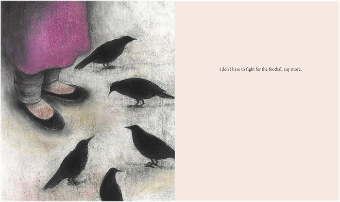
You can see the evolution of my thoughts below. Both these illustrations are for the same page. First the earlier one with the girl holding a football which did not say very much…
and the subsequent version(below)with the birds, showing a sense of loss, of missing the company of friends.
I really had no idea if there was a right way or not. At times it was like feeling my way through a dark tunnel trying to find a source of light I could progress towards.
Me — That’s such an interesting analogy — about feeling your way through a dark tunnel. It reminds me of the girl’s journey. What did you feel about the character and her journey? Was it challenging to illustrate?
Priya — My challenge as an illustrator was this: I live down in the South of India, I have hardly ever been to the North let alone Kashmir. Apart from what one sees in the news and the usual tourist eye candy on Instagram I knew nothing about Kashmir, so how could I do justice to illustrating a story happening there and that too about life during a war?
This required something beyond searching for images over the net.
What I was looking for was a common thread connecting me to the protagonist in the story; I was looking for something from which I could create an emotional bridge that would draw out a flow of empathy between this young girl and me.
Me — And how did you find this common thread?
Priya — In conflict zones, whether personal or political and in whichever country, certain common elements show up in relation to the female child: she is usually completely negated, there is a lack of food due to adults being preoccupied in their own affairs, there is isolation since it would probably be unsafe for the girl to go outside, there is loneliness, there is bewilderment at the changes happening in her body, there is no recognition, validation or articulation of the fears and emotions she experiences since no one pays much attention to her.
In a sense during conflict the female child is usually rendered invisible. The fact that the text recognized this and brought attention to this is unusual.
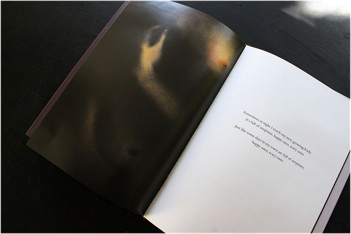
The way I could personally relate to the girl was not by imagining life within a political conflict, but by having lived through a personal one. I grew up amid my parents’ spectacularly unhappy marriage along with all the terrifying drama and silences it entailed. It seems that some by-products of conflict are universal, so in a sense, making this book was a catharsis for me. The image that symbolized all this very well is the one with the line saying, “My moods are so confusing these days…”
Me — How did you resolve the non-linear narration through visuals?
Priya — While searching for the common element to run through the entire book I decided to use parts of the girl’s body in each of the illustrations, hands, feet, shoulder, breast, the nebulous reflection of her face in the mirror showing her uncertainty, the overwhelming intensity of emotion at the changes in her body…
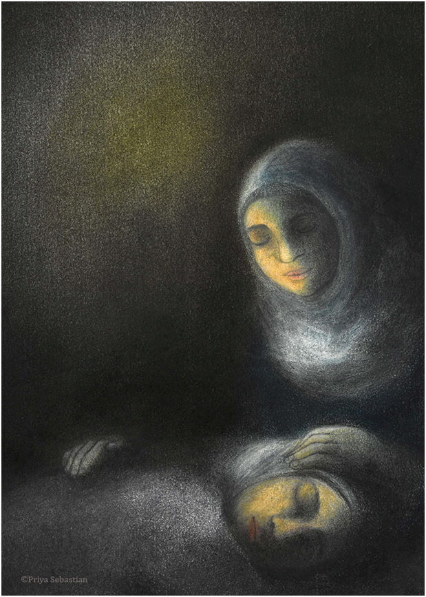
I was very aware that this is a girl on the cusp of womanhood trying to make sense of her surroundings and her situation, there seemed to be an internal exploration going on, a searching for answers. It is only in the last image that I have shown the face of the girl clearly because the text in the last page shows that there seems to be a coming to terms with her situation and there is a reaching outward, offering her love towards her weary mother.
Me — Given the strong connection you felt with the young girl in the story, how did you interpret her journey in your visuals?
Priya — I wanted to give this girl a way out of her situation into something greater, something with more hope than an eternity of trying to “be strong” in life amidst conflict.
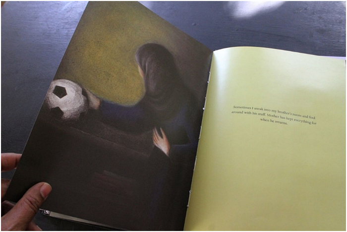
There was one line in the text which hinted at the girl’s love for football that offered me an opportunity to do this. I have not shown the football in the image that went with that line.
However, in the third last page ( below), I showed the girl finding a football in her brother’s room even if the text does not mention it. It is a suggestion, my suggestion, that perhaps her love for playing this game will eventually launch her out of her present world into something larger which aids her growth and fulfilment.
Me — I think the way you have used light and shadow and colour has played an important part in communicating that…
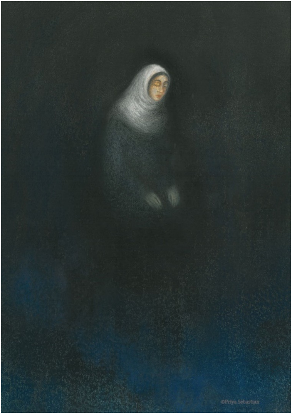
Priya — This book is all about resilience of spirit in the midst of conflict. To symbolize this in the images, I used chiaroscuro — dark shades and sparing colour to give the effect of light glowing through the dark.
Those who are familiar with my work know my preference for working in black and white and with charcoal.
For me Black and white is structure and bone. A picture in colour is meant to be looked at but black and white compels us to think.
I dread excessive use of colour in illustration because I suspect it hides something. What it usually hides is bad drawing and at other times a lack of anything to say. I use colour sparingly, only when the necessity arises and when I need to use it to convey something.

Me — Do tell us how those fantastic illustrations shaped up.
Priya — At first I simply started making lots of drawings in my giant Strathmore sketchbook, some drawings I would colour in with dry pastel in order to see where the drawings would lead me, who the protagonist would present herself to be and what emotions would emerge.
This began to give shape to a vision for the story.
Since the text did not follow the conventional linear form of storytelling I could pick and choose whichever illustration I wanted to do at that moment. The challenge with making good illustrations is that the visuals should not repeat the text but rather amplify it through metaphor, suggestion, or an alternate point of view.
I took the visuals along their own path and made them tell a story, my story, which ultimately met at the same destination as the writer’s story. I could do this because the text given to me was unembellished and non-descriptive. This allowed me to breathe life into it in the way that I had envisioned.
Me — Once the vision was more or less in place, were there challenges in executing that vision?
Priya — There were aspects like getting the anatomy of the girl correctly or making her look like the same girl in all the illustrations. I am used to working large since charcoal is a medium which needs space to breathe, however with these illustrations, I decided to work on A3 size so that I could scan them easily for clear images. This size turned out to be rather restrictive for me. A lot of the time I was applying charcoal and pastel and creating nuances in the images by using my little finger. You can say most of these illustrations have been made with my right pinky finger!
Here are some process pictures of the work that went into the cover image —my initial choice of imported paper did not work very well for the skin and nuances.
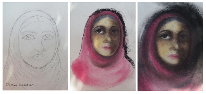
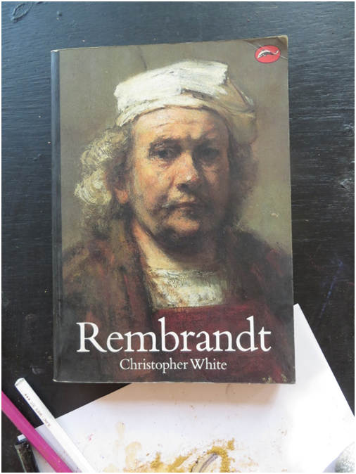
I consulted a picture of a portrait of Rembrandt to see how he had gone about working with light and shadow.
I then took out a sheet of very expensive Arches paper to do the final image. The pastels I have used are Rembrandt Pastels and Daler Rowney.
Me — It’s such a treat to see how you’ve worked on this! Another powerful image is the one that depicts the girl’s body transforming into womanhood. Do tell us about that…
Priya — This was one of the most challenging illustrations in the book and a favourite of mine.
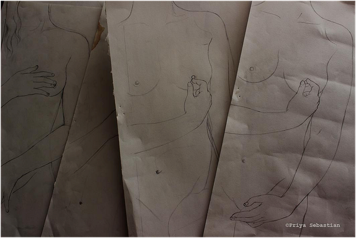
I kept tweaking the drawing until it looked right. Then I did several preparatory drawings to get the right skin tone and texture.

I found that Arches paper provided me with the best “feel” for what I wanted to say. I used Rembrandt and Daler Rowney pastels which when used with Arches paper give a kind of glow that you find in Italian Renaissance paintings.
Once I completed drawing the body and colouring the flesh, the most frightening part was taking finely powdered black pastel and smearing over key areas of the image with the palm of my hand, to give shadow and depth. Hesitation shows up on paper, so does conviction. I could use only one precise stroke of black in certain places like near the curve of the girl’s breast, so I had to get it right the first time. Most of the time, my heart was in my mouth while making this picture.
Me — It’s too beautiful for words and one of my favourites too. I see what you mean about the influence of Italian Renaissance paintings. I’ve always admired your aesthetic. How did you come to develop it?
Priya — That’s an interesting question! During my childhood and teens there were several visits to Europe and to the awe-inspiring art museums there.
Looking at the work of Great Masters in real (as opposed to its pale shadow online) is a very spiritual experience which changes you forever. It stays with you subconsciously and I would like to think that it makes its presence felt when you make your own art.
I still remember the experience of looking at Odilon Redon’s shell and the sense of calm and dignity in Gerard Palezieux’s small etchings of winter scenes.
I look to Old Masters, especially Italian Renaissance painters to provide me with answers. They are called “Masters” for a reason. I look at their compositions to see how they solve visual problems like the stylizing of fingers or creating believable perspective and compositions. The sense of elegance and refinement in these paintings helps me find the answers to articulate what I want to say in my illustrations.
My black and white charcoal work derives much of its energy from seeing the confidence with which the young Picasso drew his lines. He never doubted himself and plunged right into the drawing taking all these bold liberties which one would never have thought possible. Studying his work taught me to do the same.
Me — Did you get formal training in art?
Priya — I studied at the local art college in Bangalore which completely killed off not just my ability to draw but any other forms of creativity within me as well.
All I recall doing there is a lot of pencil shading, exact renderings of objects placed before me and the quiet desperation of trying to copy fonts as neatly as possible with Rotring pens and black ink.
It was mindless. I hated it.
During a stint in a design agency, I discovered that there was a profession called “Illustration”, something that involved illustrating stories. Wanting to study it further and after exploring all kinds of ways to do so, I ended up enrolling for a Master’s degree in Illustration in Australia. I landed there completely clueless of course but it was here that I learnt the language of illustration, to tell a story using visuals, to interpret the text rather than merely repeat it.
Me — How did the Master’s course help you?
Priya — I had to learn to make images that said something. This meant I had to think about what I wanted to say and how I wanted to say it. I had to use my imagination. Drawing became an adventure into the unknown. The process of making an image became exhilarating and challenging as never before. In time, thanks to the directness of working with charcoal, by using my hands and fingers to draw and enjoying the tactile sensations that came with it, I learnt to love drawing again and to do it with the same spirit that I did as a child.
Me — What were your earliest experiences as an illustrator like?
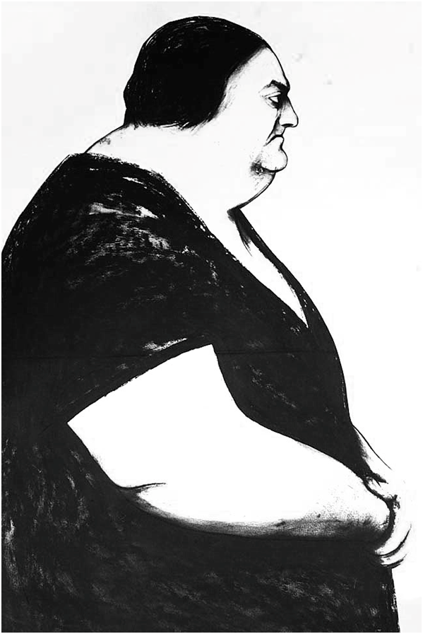
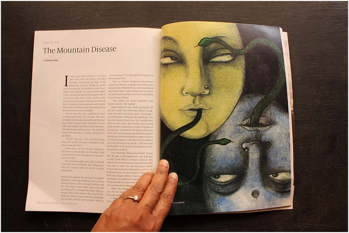
Priya — I came back from Australia with a Master’s degree from Queensland College of Art, specializing in illustration. I had a portfolio of work based on the stories of Angela Carter (below) and a thesis about the role and representation of women in Grimm’s Fairy Tales.
This was pre internet era. Nobody even knew what illustration was back then. I ended up illustrating for the mind-numbing Children’s section at a newspaper and doing drawings for a stodgy publisher. I used to courier original drawings to them which needless to say, they kept with them. I taught at an art college. I took to web designing to pay my rent. Life was very challenging to say the least.
Then subsequently social media started expanding. Blogger arrived, I started blogging and theplumtree2.blogspot.com changed everything for me. I started getting work from art directors, people started associating my name with black and white charcoal drawings, wonderful friendships and networks opened up…I owe a lot to the internet and blogging and what it’s done for my career.
Me — Do you find the industry changing now?
Priya — Of course the industry has changed a lot now. There are so many avenues for new illustrators these days to explore. You have your portfolio online and it is easier to network which helps so much. If you have a commercially viable style and if you are willing to work like a machine, I imagine there is a lot you can do.
Me — Commercially viable illustrations are not necessarily good quality illustrations, aren’t they — Some of the best illustrations in the world took insane amounts of work, time, dedication, redrawing. Do payments match up to the effort put in to make good illustrations?
Priya — There is a great deal of ignorance about what constitutes good illustration and the sheer amount of work it entails.
This is why the rate card exists where someone who can barely draw or who churns the equivalent of Clip Art, gets paid the same as an illustrator who researches and draws hundreds of preparatory drawings for making each illustration for a picture book.
The result is the illustration equivalent of fast food for children thanks to a refusal on the part of publishers and editors to envision anything beyond that on the visual menu and an unwillingness to hire and pay a good illustrator her worth.
I find it mystifying why publishers cannot talk to each illustrator, ask about time required, the kind of mediums used and its cost, treat every illustration job as unique and pay accordingly. The illustrator should state a fee based on her expenses rather than be made to cow down to a demeaning “rate card”.
Me — Payment is a very big issue isn’t it…It’s often swept under the carpet.
Priya — In this case, I began working on the illustrations for the book and as the book progressed it became clear that I would have to ease out of other professional commitments if I wanted to complete it.
It also became clear that this book would take some time to illustrate since the text posed the challenge of getting me to evoke my own story from the illustrations.
Anyone who knows anything about illustration knows that when a series of illustrations have to be done, the illustrator will retreat into a bubble where she will focus solely on the task at hand.
You cannot flit between different jobs, do a quick illustration to earn money and then return to the picture book to progress with it. It doesn’t work that way. So the question was who would pay my bills and feed me during this time?
Some illustrators work quickly based on their style, others like me take more time.
When you are sitting at your desk month after month tackling illustrations, you need to be paid accordingly because that is what it takes to survive and meet very basic living expenses.
Me — How did you manage then, having eased out of other professional work to focus on this one?
Priya — I used my personal resources to survive. I did not have anyone or anything to buffer my expenses. The stress on me and my resources from having no income for one entire year was enormous.
Me — All in all, what are your thoughts on picture books?
Priya — I think, a picture book is not the place to be descriptive with language but to convey the story. The platform of the picture book also belongs to the illustrator and a good illustrator will make full use of that.
Publishers and editors of picture books are usually writers. Many that I’ve met seem rather ignorant about the process of illustration or how much work it takes to create one single effective illustration let alone the many that make up a picture book.
If you ask them why they like one kind of illustration over the other, they will not be able to articulate their reasoning convincingly. If anything has bright colours, they will use the word ‘quirky’ and if anything uses dark colours, they will say it has ‘mood and emotion’. Then invariably someone will find “darkness” in the illustrations and everyone will retreat aghast as if darkness is a bad thing. These are such tiresome descriptions that have been thrown around forever.
Many times there is an assumption that illustrators are merely “talented” folk who draw what the text tells them to and should therefore be gently guided by the writer.
Some of my close friends are writers. But if someone who doesn’t have knowledge of drawing tells an illustrator that the illustration needs adjustments, I have to ask on what basis they are making such an observation.
An illustrator cannot look into the writer’s head to see the writer’s vision; she can only work with her own vision. The text is there to give the destination, but the route to take is the choice of the person who makes the visuals.
Me — That’s interesting. That gives me something to think about…And I hope to others involved in this field. Was there a lot of back and forth with the publishers?
Priya — I recall Sunandini Banerjee, the editor, saying, “Priya, whatever you illustrate we will publish.” I didn’t believe it at that time but eventually when the Seagull team agreed to publish this book based on the initial drawings, it was probably the best feeling I’ve had in my entire career as an illustrator.
Right from the moment they gave me the green signal up until I sent them the final files; there was no interference from them whatsoever.
Seagull Books showed that they had complete faith in me. They recognized my expertise and gave me the freedom as well as all the time that I wanted to illustrate this book.
I will always be grateful to Goethe Institut for the opportunity to attend the workshop and to Seagull books for the opportunity to work on this book.
Me — And in the initial discussions, was there an audience in mind when creating this book?
Priya — This question of an audience gets asked a lot. I realize for publishers and places which sell children’s books, the question is relevant since the book must be recommended to the right age group.
But, for me, the illustrator, I illustrated the story not with the audience in mind but in the way the story asked to be illustrated.
Sometimes it can be presumptuous to compartmentalize a book for an audience. Once the book is published and out there you have no idea who is going to pick it up and enjoy it.
Somewhere online I saw this book read to a group of riveted 10 to 12 year old girls from lower income backgrounds by an NGO, but I have also had so many adults from both India and different parts of the world tell me how much my illustrations resonated with them.
The best illustrations happen when the illustrator thinks beyond an audience and illustrates the story to reveal the truth it holds. When that happens, I believe the right audience will find its way to the book.
Me — How would you define Illustration?
Priya — Illustration is a language. Drawing and sketching are its alphabets but knowing how to illustrate is knowing how to use the language of illustration, knowing how to use mediums, texture, form, composition, metaphor and symbol to express, evoke and create a story with visuals much in the same way novelists do with words.
Me — What is it like to work on editorial illustrations?
Priya — When you do editorial illustrations for some years, it becomes like solving a puzzle, like a Rubik’s cube, there is a question posed by the story and you solve it with a visual and then hand it over to the art director and it is over and done with. You then move on to other things. It takes around 2 intense weeks to do a good editorial illustration.
By contrast it took me a year to do this book. Unlike editorial illustration where once you complete a work it stays complete, a picture book for a first timer like me seemed endless and akin to tackling a multi headed Hydra!
Each time you finish a picture you cannot sit back and recuperate, there is always another to tackle and another and another.
Towards the end, especially with the more difficult illustrations, the intensity of the work started taking a toll on my health. After making this book I am only in awe of those illustrators who illustrate many picture books. It is very challenging work!
Me — What advice would you give to people wanting to be illustrators?
Priya — When you make a work of art, it reflects everything about you, your thoughts, your personality, what you choose to read, what music you listen to, the people you associate with, your childhood, your memories, everything. The energy of who you are transfers itself into the work that you do. It would be good to be conscious of that if possible.
There is this excellent post by illustrator Mahendra Singh in which he says “artists who look at rubbish will always draw rubbish”. I couldn’t agree more. With the internet spewing “art” of all kinds you have to be very discerning about what you personally choose to absorb.
You also have to be able to articulate clearly why you like something and why you don’t. It is a part of your job as an illustrator to do so and it will help you understand your choices with more clarity.
Go back to the great artists and study their work, build your foundation on it. Keep sketchbooks as laboratories in which you experiment, play around with words and images.
Above all, enjoy yourself during the process of creating, love what you do or don’t do it at all.
‘Is It the Same For You?’ is available here and here. Get a limited edition print of the gorgeous art from this book here. You could find more of Priya Sebastian’s lovely work here and here. She can be reached at priyadarshini2208@gmail.com
Learn more about payment terms, contracts and licensing in India from Yada Yada Collective
The idea behind this series of interviews is to give readers a glimpse into the world of children’s publishing and picture book illustration in India — what illustrators actually do and how they work their magic. Stay tuned!
Read the interviews with children’s book illustrators Ishita Biswas , Sunita , Deepa Balsavar, Bhargav Kulkarni, Ruchi Mhasane, Ashok Rajagopalan
